“At Newbridge, we don’t move a muscle until we know your net worth up, down, backwards, and forwards. Our first objective is defense. We make sure it is protected from the biggest risks. Our second objective is to enlarge your net worth with a disciplined, systemic approach. And our last objective is to preserve it in line with your long-range goals. Our clients don’t argue with any of that.”
R. Christopher Wiegand, Partner
With the U.S. economy posting an anemic rate of growth in the 1rst quarter (at 0.1%, and likely to be revised lower), there is some percolation again of a more durable economic slowdown upon us. Very, very hard to say. Economists aren’t even of much help with such forecasting. The economy would have to blister higher at a 4%+ clip for the remainder of the year to come anywhere close to the Federal Reserve’s own prediction for 2014. They are notoriously inaccurate. In their defense, however, it is challenging to determine ahead of time what slowdowns become durable versus not. There are head fakes. Like now … or maybe not.
Piggybacking the last blog on the Michigan Sentiment Survey, there is a dearth of “leading” data — the stuff that helps us see what is coming next. You have plenty of “coincident” data which gives you a picture of current activity and a whole bunch of “lagging” data (especially with the employment figures) which tells you what happened but not what will happen.
Well, take a look at this graph ….
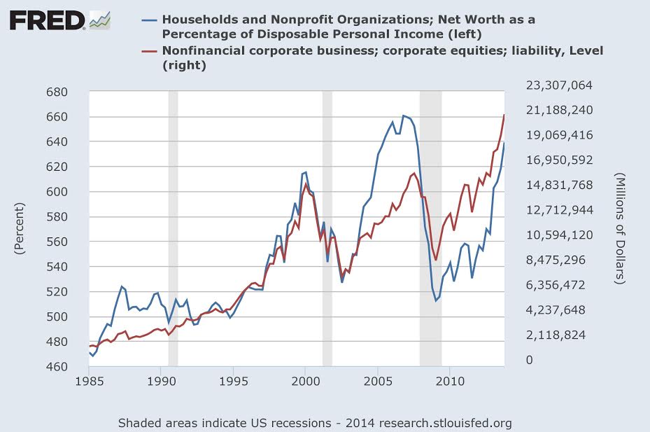
This simple data set surprised me. The blue line represents the net worth of households and charitable organizations as a percentage of disposable income. The vertical shaded areas show the last three official recessions. Observe the direction of the blue line leading up to the recessions. They are all meaningfully moving lower ahead of the recession start!
Getting behind the data during those intervals, we know one of two things was happening — net worth (the numerator) was going lower, disposable income (the denominator) was going higher, or some combination of the two. Turns out it was all net worth. Income was barely shifting.
The red line demonstrates a component of net worth – the value of stock investments. It has significantly risen since the depths of the last recession. Indeed, stocks currently represent a higher percentage of our net worth than at the market tops of 2007 (not close to the 2000 levels though). In addition to the stock appreciation, home prices have firmed since late 2011.
Through last year the net worth figures were continuing their extreme upward trend and testing the 2007 highs. Going forward, this is something to watch closely. Next numbers are due out June 5th in the Fed Z.1 Financial Accounts report! Mind your net worth.


